Product Design Internship · SPARC Sports
Designing calm into a mental-performance platform
Timeline
Aug 2025 -
Present
Client
Sergiu Celebidachi
CEO
Role
Lead Product Designer
Team
2 Product Designers
Three projects, one system — jump in anywhere
The Mission
A mental-training startup without a design language
SPARC Sports is a Mental Health Sports startup that helps athletes track performance, manage training, and connect with coaches.
Quick Preview
The redesigned app, at a glance

Where it landed
What the redesign moved: excitement, preference, trust
60%
Most excited to open the app with the new palette
Highest emotional response of every direction athletes tested
40%
Ranked the new direction their overall favorite
Top visual preference across all tested concepts
33%
Rated the redesign the most credible concept tested
Strongest perceived trust for professional mental training
Numbers are from athlete concept testing — the full breakdown lives in the reflection ↓
Designer Impact
- Increased feature discoverability by introducing a structured visual hierarchy and color system, allowing athletes to navigate reflection tools more efficiently
- Reduced cognitive load during quick check-ins through high-contrast UI patterns optimized for fast interactions during training routines
- Designed a scalable design system including logo architecture, color tokens, and reusable UI components to support SPARC's future product expansion
- Unified SPARC's visual identity across product UI, social media, pitch materials, and merchandise to strengthen brand recognition
Its Challenges
No guidance existed for how the brand should scale — every new feature made the product less consistent

The Problem & Opportunity
How might we create a brand and product experience that athletes trust and enjoy using every day?
Athletes encountered inconsistent colors, unclear typography, and a brand presence that felt similar to other sports apps.
Hard to Navigate
Inconsistent colors and typography across screens, making the product feel unpolished and hard to trust
Misleading UI/UX
UI components that varied between features, creating a fragmented experience for users
Lack of Branding
No centralized brand system to guide design decisions or future development
So... The Opportunity
With no cohesive design system guiding the product, we were presented with a design opportunity: build a clear, flexible brand foundation that improves usability while giving SPARC a distinct, performance-driven identity.
The Redesign, Mapped
Three workstreams: color, UI, brand
The hardest task was redefining SPARC's visual identity inside the app while keeping existing user flows intact. The app is athletes' primary touchpoint — every color, layout, and typography decision directly affected daily engagement and trust.

Our redesign process had THREE parts that came together in the end:
Testing color systems across real app screens
Iterating on UI layouts to improve clarity and consistency
New Brand Design for SPARC
01
COLOR SYSTEMS
Six palettes, 60+ screens, one athlete survey — how red lost to dark green.
Generative Research · 60+ Screens · 6 Palettes
Testing palettes on real screens, not swatches

Before finalizing the brand direction, we needed to understand how different color palettes would feel in real usage.
Aka... A LOT of screen iterations...
Explored two main options:

I created 60+ app UI variations across six color themes, narrowing to four finalists — so we could compare how each palette affected hierarchy, mood, and trust on the same screens.
Why red was working against reflection
Because SPARC focuses on mental performance, color directly affects how athletes feel while reflecting and training. I researched color psychology to understand how palettes influence emotion and behavior.
RED IMPACT ON ATHLETES (Original Color Tone)
Red risks signaling stress or pressure rather than controlled mental preparation. The heightened arousal can work against the calm, reflective mindset SPARC aims to cultivate, potentially increasing anxiety during critical moments.
Red accents (#831923) in navigation and chart elements create visual urgency. This heightened activation may cause athletes to feel pressured or anxious when reviewing their mental performance data, working against the goal of calm reflection and growth mindset development.
Red edit icons (#831923) create tension during reflective journaling. This emotional state disrupts the vulnerable, introspective mindset required for honest self-assessment and meaningful mental training progress.
Exploration, Continued
The other contenders, on real screens

Athlete Testing
Cobalt won preference — dark green won the workflow
Testing narrowed six themes to two finalists. Cobalt Blue drew the strongest raw preference; Dark Green won on usability and calm — a tension the data below made us resolve deliberately.
60%
Emotional Activation
Of athletes said Cobalt Blue and Dark Green made them most excited to open the app and begin mental training: the highest emotional response across all options tested.
40%
Visual Preference
Ranked Cobalt Blue as their overall favorite, tying for the top visual preference and reinforcing athlete appeal for clean, brighter interfaces.
33.3%
Credibility & Trust
Of athletes identified Cobalt Blue as the most trustworthy option, demonstrating strong perceived credibility for professional mental training.
33.3%
Usability
Found Dark Green easiest to navigate during quick check-ins, supporting athlete workflows that require speed and clarity under pressure.
Bottom Line
Dark Green became the direction — it balances excitement, trust, and usability for SPARC's athletes, where cobalt's popularity didn't survive the quick-check-in workflow. Qualitative feedback reinforced clean, slightly brighter interfaces that stay calm and professional.
The Decision
Dark green: balance over urgency
We chose the palette that served the mental-training context over the crowd favorite: dark green keeps athletes calm while reviewing the exact same data that red made stressful.
GREEN IMPACT ON ATHLETES (New Color Theme)
Dark green communicates balance and stability, better aligning with SPARC's goal of helping athletes regulate emotions, build confidence, and enter training sessions with a composed, performance-ready mindset.
Green accents (#126b40) provide visual grounding while reviewing metrics. Athletes can calmly assess their progress without stress signals, supporting emotional regulation and confidence building: key to sustainable mental performance improvement.
Green selection indicators and checkmarks reinforce positive progress without urgency. Athletes feel encouraged and focused, entering their training with the centered mindset necessary for peak mental performance.
TL;DR — The Colorway Call
The dark green system is psychologically better suited to mental training. Red commands attention and signals urgency — the opposite of the calm, controlled, reflective state SPARC exists to build. Green's associations with balance and grounded focus let athletes regulate emotions and prepare mentally without added pressure.
“Mental training requires psychological safety and calm — conditions that green naturally supports and red naturally disrupts.”
Dark green locked the palette — but a palette can't fix a dashboard athletes couldn't scan in ten seconds. Part 2 takes the new system into the UI.
02
UI DESIGN
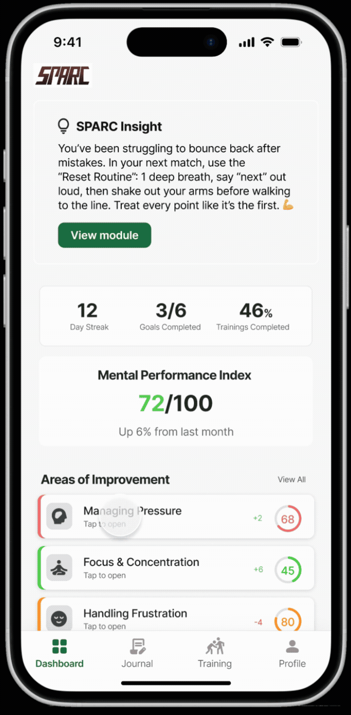
Four dashboard iterations — making progress scannable in a ten-second check-in.
Overview
Making progress scannable in a ten-second check-in
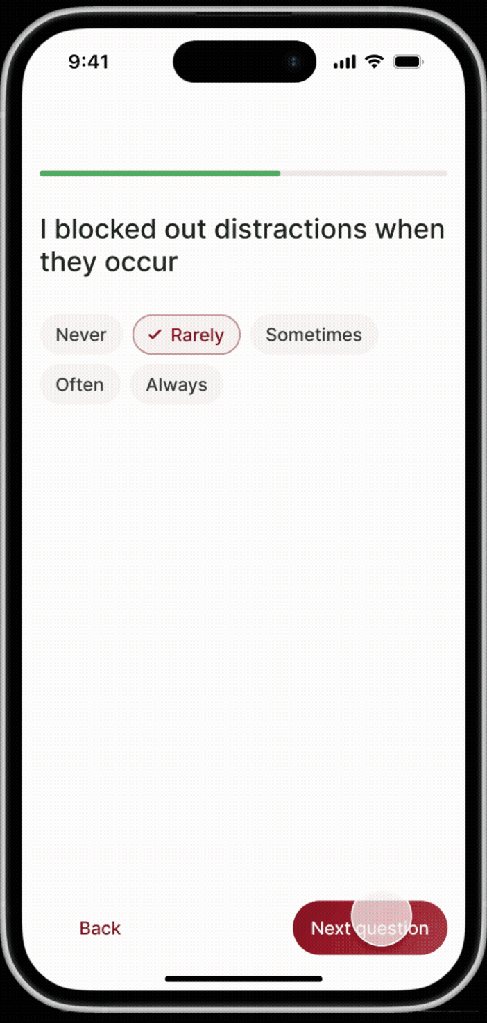
I iterated on progress patterns, information density, and hierarchy with one goal: improvement trends athletes can read at a glance — mid-training, between points, without thinking.
How might we visualize athlete progress so improvements feel clear, motivating, and instantly scannable during quick check-ins?

Iterations
Four rounds: linear bars → a card system
Each round fixed what the last one taught us: bars surfaced scores but hid priorities → remaining-counts added momentum → insights and bigger numbers added meaning → cards finally made the next action obvious.

OUTCOME: Improved scan speed and clarity, helping athletes quickly identify priorities and take action.
User Needs & Design Implications
From buried modules to one obvious next action
Reviewed athlete feedback, scan behavior, and sports-UI benchmarks — then rebuilt the training library around glanceability, lower cognitive load, and motivational framing.

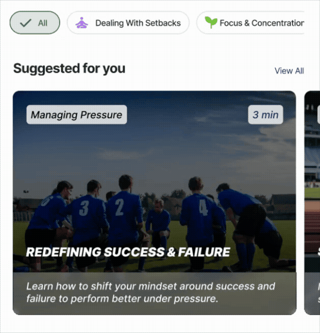
OUTCOME: Increased content discoverability and scan speed, helping athletes quickly find and start the right training module.
TL;DR — Clarity Drives Confidence
The refined UI prioritizes clarity and cognitive ease. Earlier layouts surfaced the data but added visual friction during quick check-ins. Stronger hierarchy and simpler progress signals let athletes interpret performance fast, trust their progress, and move into training with focus instead of hesitation.
With color and UI speaking the same language, one gap remained: a logo that still said “energy” when the product now said “control.” Part 3 rebuilds the mark itself.
03
LOGO & BRAND REBRAND
From star-badge sketches to an athlete in motion — an identity that trains calm.
3.1 · Brand Foundation
“Mental strength isn't a mindset. It's a system.”
SPARC positions mental performance as a structured, trainable discipline rather than an abstract concept. The brand balances athletic intensity with psychological control, creating a visual language that feels focused, grounded, and performance-driven.

Mental performance tools often rely on high-intensity visual languages that emphasize urgency over control. This creates a mismatch with SPARC's goal of helping athletes enter a calm, focused, and reflective state before performance.
I developed a grounded, green-led brand foundation that visually reinforces stability and controlled readiness — shifting the identity toward calm authority so the system supports athletes in regulating emotions and preparing mentally under pressure.

3.2 · Logo Symbol Breakdown
Every Element Has a Purpose
The SPARC logo system is built from five distinct symbolic elements, each rooted in the brand's core values of mental strength, athletic readiness, and performance focus.

3.3 · Color System
Calm Under Pressure
A grounded green-led palette reinforces emotional control and focus while reserving bright accents for moments of action.
COLORS

Dark green reinforces balance, stability, and grounded focus — key emotional states for mental performance training. Bright CTA green is used sparingly to signal moments of action without introducing stress-inducing urgency.
Direct application on logos:

3.4 · Typography
Strength Meets Clarity
GOODTIMES delivers athletic impact in headlines while NIMBUS SANS ensures high legibility and scalability across the product experience.

3.5 · Logo Design Process
Two directions died before the athlete emerged
Four phases — sketches, monogram iterations, spark explorations, final refinements. The star-topped monogram read like a sports-badge trophy, and the literal four-point spark read as generic energy. The final mark keeps the spark's momentum but carries it in an athlete's form — movement with control.

FINAL LOGO


TL;DR — An Identity That Trains Calm
The rebrand gives SPARC one visual language across product, pitch, and merch. An athlete-form mark, a grounded green palette, and a two-font system now say the same thing the app does: controlled readiness — not urgency.
04
RESULTS & REFLECTION
What athlete testing showed, and what SPARC taught me about designing across systems.
Testing Results
How athletes rated the redesign
60%
Most excited to open the app with the new palette
The redesigned direction drew the strongest emotional response of every concept athletes tested.
40%
Ranked it their overall favorite
Top visual preference across all tested directions — the Dark Green system was selected as the product identity.
33%
Rated it the most credible concept
Athletes judged the redesigned interface the most trustworthy option for professional mental training.
From athlete concept testing across the finalist color systems.
Takeaways & Reflection
What working on SPARC taught me about designing across systems
Brand and product should speak the same language
Working on SPARC showed me how closely brand identity and product design are connected. Translating the brand into color, typography, and UI patterns helped create a more cohesive experience for athletes across the platform. It reinforced that brand is not just marketing — it actively shapes how a product feels and functions.
Color is a functional design tool
Testing favored cobalt on pure preference, but dark green served the mental-training context better — and choosing function over popularity was the real lesson. The final green system established stronger hierarchy, faster scanability, and a calmer emotional tone. This project shifted how I think about color: not visual style, but a tool that guides attention and behavior.
Designing systems, not just screens
From UI patterns to brand assets, this project pushed me to think beyond individual screens and toward building a scalable design system. As SPARC continues to grow, the foundation now supports future product expansion — including the upcoming website redesign.
More importantly, this project shifted my perspective from designing isolated visuals to designing connected systems where brand, interface, and product strategy evolve together.